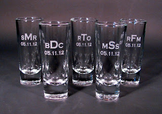
Photography is one thing I've struggled with since opening my Etsy shop over 4 years ago. My photos have definitely gotten better since the first ones I uploaded! But with each new product comes new struggles it seems.

Photo courtesy of Wake Photography
Since I started selling glass items, I've run into a whole new territory for photography. My friend Melanie at Wake Photography was nice enough to come take photos for me to upload my first glass items to Etsy. She did an awesome job and I wish I had her here all the time to take more pictures! But I like to take photos as I make items and sometimes I'll take photos of custom orders before I ship them, so I don't have the option to wait for the photos to be taken. So it's time I started learning on my own!

My backdrop was the first thing that had to change. I usually take my photos on a white background, but that's just not an option with glass. I found that black worked about the best and all I had on hand at the time was a black table cloth. It worked, but it wasn't the greatest. (Of course Melanie made it look awesome!) So the other day I purchased sheets of black poster paper to lay inside my light box. After I finally got it cut to size, it worked pretty well!


.jpg)


I like the new photos!
ReplyDeleteI would think it would be super difficult to take pictures of glass because of all the reflections but you did an awesome job.
The black poster paper works very well! It's not too dark and all the details on the glass show up perfectly! Well done!
ReplyDeleteI think that they are excellent. I like the softer black of the poster paper, it almost looks grey. Very elegant.
ReplyDeleteThey are great! The glass & engraving pops a lot more than on the other images.
ReplyDeleteGlass is so hard to photograph. I think the photos look great. They are sharp and I can see the detail of the inscriptions.
ReplyDeleteThere is a photography team on Etsy. They give constructive critiques and good advice.
Looking good! No glare. You can see the outlines of each piece. AND your inscriptions show up beautifully.
ReplyDeleteNot more to say than has already been said, the paper background made a huge difference in the detail of the glass and the etchings. You did an excellent job with a challenging task!
ReplyDeleteI think you did a great job. I have a difficult time taking product photos. Making sure to show the colors and details for a listing is just not easy. You did a great job showing off the glasses and what you can do with them.
ReplyDeleteErika
Artful Rising
I think the photos are superb and definitely worthy for listing! Great job!
ReplyDeleteThank you everyone for your comments! I worked really hard on these and your comments really mean a lot to me :)
ReplyDeleteI think that your photos are great! I have struggled with glass reflection even with my little pendants. I'm sure that these are much more challenging. The clarity is great, though. I think that the darker background works well with the glass. Having all of these new wedding glass options will be a great addition to your shop.
ReplyDeleteI think the photos look fantastic Edi, very clear, crisp and professional. I will readily admit that taking the pictures is the only part of the process that I dislike. I get so frustrated and have since decided to 'hire' my daughter to photograph for me! It works our for us both, and I can get back to what I love most. :)
ReplyDeleteI think your photos look great! The gray background is perfect and really showcases the etching.
ReplyDeleteValerie
Everyday Inspired
Thanks for sharing your frustrations with photography...and more important, your solutions! I'm learning as I go and your mastery here is certainly helpful. Well done!
ReplyDeleteI like the lighter background you're using now. The glasses don't fade out.
ReplyDeleteI think they look great. I like the soft black background.
ReplyDeleteThese are looking really nice! I think a little bit of reflection looks nice because it makes the glass look sparkly.
ReplyDeleteAlready been a lot said, but I like the look of the last three over the bride and groom photo.
ReplyDeleteI like the ones on the grey background way better than the black. I read recently to never use black as a background for jewelry, maybe it holds true for glass, too. It's just too harsh and takes away from the translucency of glass. Good job!
ReplyDeleteThe photos look great. Very clear!!!
ReplyDeleteYou did a great job! I think glass has got to be the hardest thing to photograph.
ReplyDelete