


.jpg)


Thanks to the wonderful Patch of PatchFirstShop...I have new business card designs!!!
One of my goals for this year was to update my blog with a new design. I was happy to get this done early on and wanted to make my shop match as well. I just updated my Etsy Shop banner this past week and love it! Now it's time for new business cards :)
I need your opinions!!! Which design do you like best...and why? I would love any and all comments on this topic!
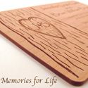
1)
 2)
2) 3)
3) 4)
4)
Note: The blurred area is where my phone number will be.
Thanks again Patch!!! These ROCK!


You're welcome Edi!!!
ReplyDeleteI like the first one coz it's simple but don't like the red frame.. (not sure I made one without frame for you..)
But I think the fourth one is matching to all of your templates..
Anyway, I like your font and hope that you keep it.. :D
They are all nice but I really like the last one! It really pops and it matches your banner. It also has room for a picture of Harley in the center of that green circle! :D I think his cute face should be everywhere!
ReplyDeleteThe third one is my favorite. I don't include my phone number on my business cards. Patch's designs are great!
ReplyDeleteI really like no. 1 and 2!!
ReplyDeletePatch certainly did a great job with all of them!
I like 1) and 4). Like the dreamy circles the best, in 1) - and it's nicely balanced. I think #2, the scalloped side is nice, but it might catch and bend easily... though it would show up in a pile of dif. cards. #3 the font is a bit small and crowded. my 2+¢ {:-D
ReplyDeletewow - this is a tough one.
ReplyDeleteI love the circles in the first one, because I love circles :) But the others look more "scrapbooky"
I think I like #2 the best because it has the circles & the left edge is very "scrapbooky"
Between 3 & 4 - I like the layout of 4...your name stands out better
so - are we helping or just making it tougher? Having a couple differnt designs isn't too bad either since they all flow together & flow with your blog
Did you make a decision yet? I like the last one because I thought it was bold but at the same time your information was very clear & easy to read and understand.
ReplyDeleteThese are all great! The 4th is a better design then the 3rd, in my opinion. I do think I like the 4th best overall.
ReplyDeleteThis comment has been removed by a blog administrator.
ReplyDelete