Photos are something I think every Etsy seller struggles with! We want our photos to be the best they can be as our customers can't touch, feel or handle or items. My photos are a constant work in progress!
I've updated some of my Custom Listings with new, brighter photos. I think they are "better" but not the "best". I like that they are brighter, but some of them are too bright! They went from underexposed to overexposed in some cases! My light box is made of foam board and has a shiny surface. I think this acts sort of like a flash and makes some areas brighter than others and makes it difficult to adjust the white balance. I tried to cover it with a white sheet thinking that would keep it from being too shiny, but that just showed wrinkles...ugh!
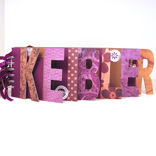
Let me know what you think of my Custom Name Album listing. Are they better? Too overexposed? Here is the photo I was using for my first photo: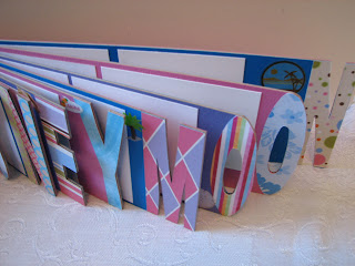 And here is the new first photo. You can also click on the photos to be taken to a sold listing and a new listing to see all the new photos.
 Do you struggle with photos too? Have any great tips you'd like to share? Let me hear 'em :)
 And here is the new first photo. You can also click on the photos to be taken to a sold listing and a new listing to see all the new photos.
 Do you struggle with photos too? Have any great tips you'd like to share? Let me hear 'em :)


.jpg)




I think these are better. The second photo is nice, bright and crisp looking and it is easier to see the colors.
ReplyDeleteYou did great! (Off to check out the shop)
I agree! Photos are a pain sometimes. (Especially right now with my camera broken!) I do everything I can to get a good photo and, it seems, something is always not quite right. I also agree that we need to keep trying!
ReplyDeletePhotos are the worst thing for me since I can't seem to get a lightbox to work without turning the background pink and we're short on sunlight here in the winter. I really do like your new updated photo though and it certainly would get my attention!
ReplyDeleteI hate photographing my work - heard about the white balance, but can't find it on my camera. I like the second pic better too. It's nice to have a close, close-up, but seeing the entire book is very appealing. My journals - I show them both ways, for the initial photo - some of my covers are so pretty I like to show a close-up.
ReplyDelete